

It’s Thursday and time for another Book Traveling Thursday. This weekly meme was created by Cátia @ The Girl Who Read Too Much and Danielle @ Danielle’s Book Blog. Visit their Goodreads group to learn more about Book Traveling Thursday 🙂
The rules are to share covers related to the weekly theme where you include the original cover, the cover from your country, your favorite, and your least favorite. I’ve decided to go for a top 3 and bottom 3 arrangement, because that’s more fun and I get to showcase more covers.
This week’s theme is “an underhyped book”
I own a lot of books that I don’t see people talking about often, but the thing is I haven’t read most of them yet XD So I don’t know, I’m just going to go with More Than This by Patrick Ness. It’s by no means underhyped or underrated, but I just wish I saw more people talking about it. When people talk about Patrick Ness they usually mention the Chaos Walking series or A Monster Calls. But More Than This is definitely my favorite of the ones I’ve read by him.
ORIGINAL COVER
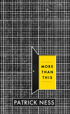
I love this one, even though it hurts the eye a little bit. My favorite thing about it is that the yellow door with the title is not actually on the front cover, it’s a cut out hole.
COVER FROM NORWAY

Once again, I’m pretty sure only A Monster Calls has been translated into Norwegian 😦
TOP 3 FAVORITE COVERS
 There weren’t that many different ones to choose from, at least not on Goodreads (I can’t be bothered to google to see if there are more lmao), but I managed to find a top 3.
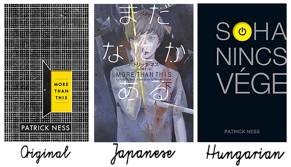
The original one of course, because I love the cut-out.
And then the Japanese one(s). They’ve split this novel into volume 1 and 2, and this is the cover of volume 2, I decided to just show one of them even though I like both. I don’t know, I like the colors and the font, even if it looks like a manga. It’s intriguing.
The Hungarian cover is very simple, but like the original one, a simple cover contributes in keeping this book a mystery. I love the power button.
BOTTOM 3 COVERS
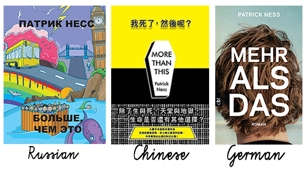 Oh Russia. You did so well last week, but here we are again. The only thing I like about this is the rainbow (shout-out to Seth and Gudmund?) Other than that it’s just a mess. This book might be a bit surreal, but this is too surreal. And the font is horrible.
I appreciate what the Chinese cover is trying to do, but to me it looks too messy and choppy.
And I don’t hate the German one, but since I’ve decided to do a top 3 and bottom 3 each week I just had to pick one, so I landed on this because it looks too contemporary (this book is sci-fi). I’d like it if it belonged to a contemporary coming-of-age type book.
What do you think of these covers? Which one’s your favorite and least favorite?
Follow me on Twitter | Goodreads | Bloglovin’ | Instagram |

Great choice, I LOVE that book so much! But you’re right, the Russia cover definitely isn’t good. My favorite is the original 🙂
LikeLike
This book is amazing 😀 I think the Russians were high when they made the cover LOL
LikeLiked by 1 person
HAHAHA, that’s an interesting theory :p
LikeLiked by 1 person
Is it bad that I’ve never desired to read a Patrick Ness book?
LikeLike
hahaha, definitely! He’s so great, this one is one of my all-time favorites 😀
LikeLiked by 1 person
Damn, I don’t know I’ve just never felt attracted to his books
LikeLike
Oh well, you can’t be into everything 😀
LikeLiked by 1 person
As long as we’re still friends! Haha don’t hate me
LikeLiked by 1 person
Hahaha no worries! ❤
LikeLiked by 1 person
omg, that russian cover reminds me of Yellow Submarine by The Beatles… lol, no idea why!
LikeLike
hahaha! No idea why either, but nice! XD
LikeLiked by 1 person
😉
LikeLike
OMG that Russian cover for me is almost so bad it’s good. I love this meme!
LikeLike
I know, right? If only it had more to do with the book XD
LikeLike
My goal of this year is to finally read a Patrick Ness book. I’ve heard so many good things about his work I feel like I’m missing out haha. I love the sound of More Than This and I love the original cover. The Russian cover looks odd and it just feels to busy.
LikeLike
I was going to say that I find the German cover pretty, but then I read your reasoning behind it and I have to agree. It looks very contemporary.
LikeLike